This entry was posted
on Sunday, February 26th, 2017 at 9:17 pm and is filed under Uncategorized.
You can follow any responses to this entry through the RSS 2.0 feed.
You can leave a response, or trackback from your own site.
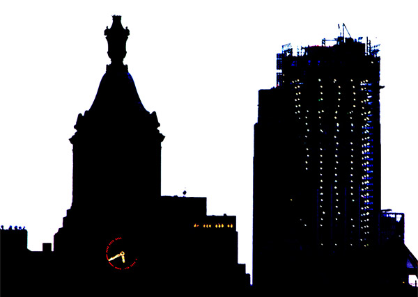
OOH I love this photo! The silhouetted buildings are beautiful and I especially like that you caught the lights of the clock face and hands. It’s almost like a black and white that isn’t so black and white 🙂
Seems like in the old days, there was far more time; time for architectural ornamentation, time to enjoy the artistry, and now it’s just a bare bones hurry and reach the sky! How fitting, which building has the time to tell the time!

OOH I love this photo! The silhouetted buildings are beautiful and I especially like that you caught the lights of the clock face and hands. It’s almost like a black and white that isn’t so black and white 🙂
Wow! This looks like a cut-out rather than a photo–what a great juxtaposition! I love the sharp lines contrasting the white background.
A study in positive and negative space as well as shape. Interesting.
Time has stopped on the flattened silhouettes of these frilly cutouts.
Powerful imagery here, Ellen.I love the stark blackness played against the bright red clock border – and what a perfect title!
Beautiful geometric silhouette! The clock certainly stands out in all the blackness! Great photo Ellen!
Great juxtaposition of the old and new (building under construction). The partially illuminated clock is (no pun intended) striking.
Seems like in the old days, there was far more time; time for architectural ornamentation, time to enjoy the artistry, and now it’s just a bare bones hurry and reach the sky! How fitting, which building has the time to tell the time!
Absolutely so clever to catch the clock lit up while the buildings are dark. It is these kinds of twists that make your work so exciting.